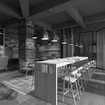
ZhongAn Insurance
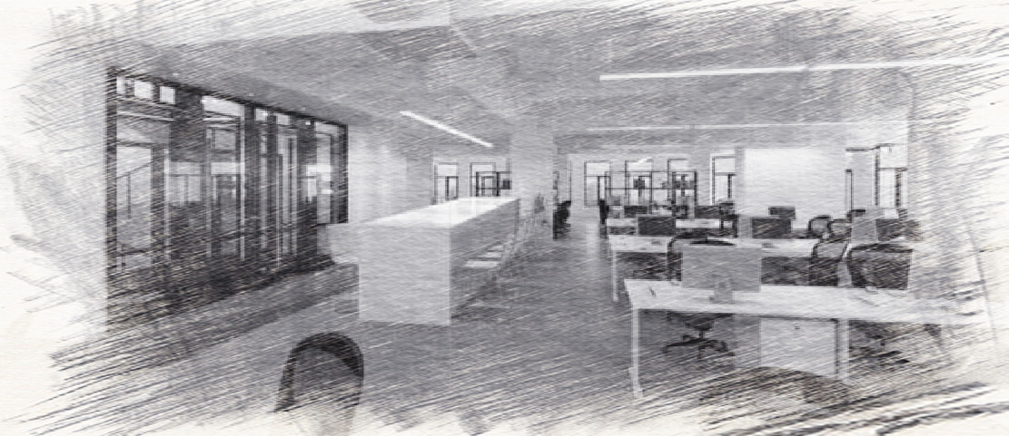
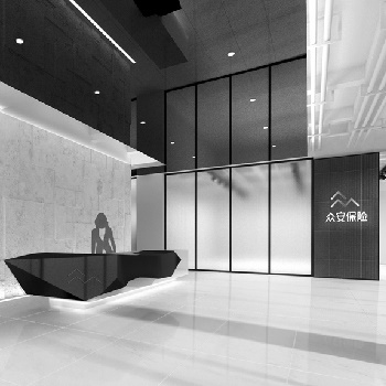
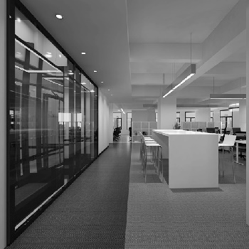
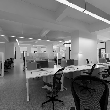
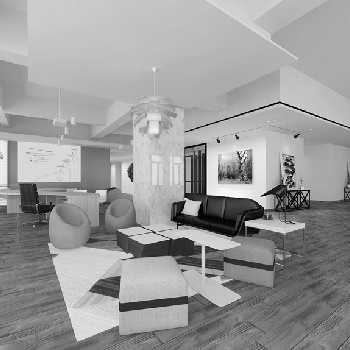
For Zhong’an insurance company we had to create a clean, simple but young design so our design incorporated a few accents of color. Each floor has a different color accent, easy for customers to self-orientate themselves but also establishing a hierarchy. The shared areas on each floor will be the accents that will bring a freshness to the whole space; while the structure core is used as a build-in signage, guiding the user along the space. The intention was to pair a bold graphism with a serene way of light – creating a dynamic atmosphere.

